

Mobile optimization is defined as the process of ensuring your website loads fast, displays correctly, and functions well on smartphones and tablets. Right now, mobile devices generate approximately 57–59% of all global web traffic. That means more than half your potential customers are reaching your site from a phone, not a desktop. If your site is not built for that experience, you are losing them before they ever read a word.
Google compounds the stakes further. Mobile-first indexing means Google evaluates your mobile site first when determining where you rank in search results, for every device. A slow or broken mobile experience does not just frustrate visitors. It actively drops your search rankings. For business owners and digital marketers, the question is no longer whether to prioritize mobile. The question is how fast you can fix it.
Why optimize for mobile users: the direct business case
The business benefits of mobile optimization are concrete and measurable. Speed alone has a direct line to revenue. 53% of mobile visits are abandoned when a page takes longer than three seconds to load, and a single-second delay can cut mobile conversion rates by up to 20%. Those are not abstract metrics. They represent real customers who left before seeing your offer.
Beyond speed, mobile optimization improves outcomes across several business dimensions:
- Higher conversion rates. Faster load times and cleaner layouts reduce friction. Features like short forms, autofill, and digital wallets fund roughly half of all online mobile purchases, cutting cart abandonment significantly.
- Better local search performance. 76% of local mobile searches result in a store visit or direct action within 24 hours. A mobile-friendly site captures that intent; a slow one sends it to a competitor.
- Stronger SEO rankings. Because Google uses mobile-first indexing, your mobile site's performance directly shapes where you appear in search results on all devices.
- Improved AI search visibility. AI search engines prioritize websites that load fast and present clean, structured content. A well-optimized mobile site earns more citations and featured placements in AI-driven results.
The importance of mobile optimization extends beyond your website. It shapes how customers find you, how they experience your brand, and whether they take action. For local businesses in particular, a mobile-friendly presence is the difference between showing up in the local map pack and being invisible.
Pro Tip: Check your site's mobile performance using Google's PageSpeed Insights. It scores your Core Web Vitals and flags specific issues to fix, ranked by impact.

How does mobile user behavior shape website design?
Mobile users behave differently from desktop users, and your design must reflect that. They scan rather than read, expect instant access to key information, and navigate with their thumbs, not a mouse. Designing for a desktop first and then shrinking it down for mobile creates friction at every step.
Three behavioral realities define mobile UX:
- Scanning over reading. Mobile users make quick judgments. Short paragraphs, bold headers, and bullet points keep them engaged. Dense blocks of text cause them to bounce.
- Thumb navigation. Most users hold their phone with one hand. CTA buttons placed in the thumb zone, which is the bottom-center of the screen, get more clicks and fewer abandoned sessions.
- Speed impatience. Mobile users expect pages to load in under three seconds. Core Web Vitals like Largest Contentful Paint under 2.5 seconds are critical for both user experience and Google ranking.
Context matters too. Mobile browsing often happens on the go, between tasks, or in low-attention environments. Your site needs to deliver its core value in seconds, not minutes. A nail salon's phone number, a restaurant's hours, or a med spa's booking button should be visible without scrolling.
Pro Tip: Test your site on a real phone, not just a browser's mobile emulator. Emulators miss real-world issues like tap target size, font rendering, and scroll behavior.
What technical strategies actually improve mobile user experience?
Responsive design is the foundation of any mobile-friendly site. It means your layout adapts automatically to any screen size without requiring a separate mobile URL. But responsive design alone does not guarantee a good mobile experience. Long forms, tiny buttons, and heavy images can still destroy usability on a technically responsive site.
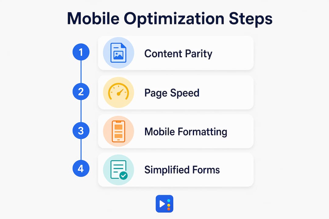
1. Maintain full content parity
Google's mobile-first indexing means the content on your mobile site must match your desktop version. Hidden or collapsed content on mobile, such as text tucked behind tabs or accordions, can reduce your search visibility. Every important page element, including text, images, and links, needs to be present and crawlable on mobile.
2. Speed up your pages aggressively
Page speed is not a nice-to-have. Compress images, use next-gen formats like WebP, and minimize JavaScript. Defer non-critical scripts so the page renders fast. Hosting quality matters too. A slow server adds load time before the browser even starts rendering your page.
3. Format content for mobile reading
Short paragraphs of two to three sentences work best on small screens. Use H2 and H3 headings to break up content. Place your primary call to action high on the page, and repeat it at the bottom. Avoid pop-ups that cover the full screen on mobile. Google penalizes intrusive interstitials in mobile search rankings.
4. Simplify forms and checkout
Short forms with the correct keyboard type (numeric for phone numbers, email for email fields) reduce errors and drop-off. Autofill support and digital wallet options like Apple Pay or Google Pay remove steps from the checkout process. Fewer steps mean more completions.
The comparison below shows how desktop-first design choices create mobile problems, and what the mobile-first alternative looks like:
| Design choice | Desktop-first result | Mobile-first result |
|---|---|---|
| Navigation menu | Full horizontal nav bar | Collapsed hamburger menu |
| CTA button placement | Top-right corner | Bottom-center thumb zone |
| Form fields | Multiple fields per row | Single column, large tap targets |
| Images | High-resolution, uncompressed | Compressed WebP, lazy-loaded |
| Font size | 14px body text | 16px minimum body text |
Pro Tip: Removing unnecessary desktop elements from your mobile version, such as decorative sidebars or large hero animations, improves both speed and Google rankings.
How does mobile optimization affect local search and AI visibility?
Local search and mobile are inseparable. When someone searches "nail salon near me" or "best med spa in Austin," they are almost certainly on a phone. 76% of those searches convert to a physical visit or direct contact within 24 hours. A site that loads slowly or displays poorly on mobile loses that customer to whoever ranks above it.
Google's mobile-first indexing raises the stakes further. Your mobile site's speed, structure, and content quality determine your ranking for all searches, including desktop. This means a business with a fast, well-structured mobile site outranks a competitor with a beautiful desktop site that performs poorly on phones. For more on how this connects to map rankings, see Google Maps ranking factors and how mobile performance plays into local visibility.
AI-powered search tools add another layer. Platforms that generate AI-driven answers pull from sites that are fast, clearly structured, and easy to parse. A slow or cluttered mobile site gets skipped. The impact of mobile traffic on AI search visibility is growing, and businesses that invest in mobile SEO now will hold a structural advantage as AI search becomes the default.
"Mobile optimization is no longer just about user experience. It is a direct ranking signal, a local search driver, and an AI visibility factor. Businesses that treat it as optional are competing with one hand tied behind their back."
The data table below summarizes the key mobile optimization signals and their business impact:
| Signal | What it affects | Business outcome |
|---|---|---|
| Page load speed under 3 seconds | Bounce rate, conversions | Fewer abandoned visits, more leads |
| Mobile-first indexing compliance | Search rankings | Higher visibility on Google |
| Local mobile search presence | Foot traffic, calls | More in-store visits within 24 hours |
| Core Web Vitals (LCP under 2.5s) | UX and Google ranking | Lower bounce, higher rank |
| AI-readable content structure | AI search citations | Featured in AI-generated answers |
For small businesses competing in local markets, local search visibility starts with a mobile experience that works. That connection between mobile performance and local rankings is one of the most underestimated advantages available to small business owners right now.
Key Takeaways
Mobile optimization is the single most impactful technical investment a business can make to improve search rankings, local visibility, and conversion rates in 2026.
| Point | Details |
|---|---|
| Mobile traffic dominates | Over half of all global web traffic comes from mobile devices, making mobile the primary discovery channel. |
| Speed drives conversions | A one-second delay cuts mobile conversions by up to 20%; pages must load in under three seconds. |
| Local search converts fast | 76% of local mobile searches lead to a store visit or direct action within 24 hours. |
| Mobile-first indexing is real | Google ranks all sites based on their mobile version first, so mobile performance affects desktop rankings too. |
| Design for thumb and scan | Place CTAs in the thumb zone, use short paragraphs, and maintain content parity between mobile and desktop. |
Mobile-first is a mindset, not a checkbox
I have worked with enough small business owners to know the most common mistake: they build a great-looking desktop site, then check a box labeled "mobile responsive," and call it done. That approach misses the point entirely.
Mobile-first design means you design the phone experience before anything else. That constraint forces good decisions. You cut the clutter. You prioritize the one action you want visitors to take. You write shorter copy. Every one of those decisions also improves your desktop site and your search rankings.
The businesses I see winning in local search right now are not the ones with the fanciest websites. They are the ones whose sites load in two seconds, show a click-to-call button above the fold, and have a Google Business Profile that matches their mobile site content. That combination drives real calls and real foot traffic.
One more thing most articles skip: mobile optimization is not a one-time project. User behavior shifts, Google updates its algorithms, and your competitors keep improving. The businesses that stay ahead run monthly speed checks, test on real devices, and watch their website speed metrics the same way they watch their revenue numbers. Treat mobile performance as an ongoing discipline, and it will keep paying you back.
— Tran
How Yourlocalseo helps your mobile presence perform
Yourlocalseo works with small businesses across Pflugerville, Austin, Round Rock, and surrounding Central Texas communities to build websites that perform on mobile and rank in local search. We handle the technical side, including page speed, responsive design, and content structure, so your site meets Google's mobile-first standards and shows up where your customers are searching.

Our team combines mobile SEO best practices with Google Business Profile optimization, citation building, and on-page SEO to build a complete local presence. Whether you run a nail salon, a med spa, or a service business, we tailor every strategy to your location and your goals. Visit Yourlocalseo to see how we can improve your mobile rankings and turn more searches into real customers.
FAQ
Why does mobile optimization matter for search rankings?
Google uses mobile-first indexing, meaning it evaluates your mobile site first when determining search rankings for all devices. A slow or poorly structured mobile site directly lowers your position in search results.
How fast does a mobile site need to load?
Pages must load in under three seconds. A one-second delay reduces mobile conversion rates by up to 20%, and 53% of mobile visitors abandon a site that takes longer than three seconds.
What is the difference between responsive design and mobile optimization?
Responsive design adjusts your layout to fit any screen size, but it does not guarantee a good mobile experience. True mobile optimization also includes fast load times, thumb-friendly navigation, short forms, and content formatted for scanning.
How does mobile optimization affect local businesses specifically?
76% of local mobile searches result in a store visit or direct contact within 24 hours. A mobile-friendly site captures that high-intent traffic; a slow or broken one sends it to a competitor.
What are Core Web Vitals and why do they matter for mobile?
Core Web Vitals are Google's performance metrics for user experience, including Largest Contentful Paint, which measures how fast the main content loads. An LCP score under 2.5 seconds is required for good standing in both user experience and Google ranking.